
As you've seen, if you've checked in recently, I've been tooling around with my header. Over the last 48 hours, it's been...


(And there was another one before this that had a choppy looking picture of Bill's face...not good.)
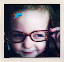
So, I think this last one is best, with the exception of the upper left corner. Any thoughts? I also thought the middle one was good, but some of the pictures felt really shopped up. I love the one of Josephine crawling, but her head looks funny. Because in the real picture, it's cut off at the top. And, the pumpkin, same deal. But, looking at them all here, I kind of like the middle one...But, anyway, by the next time you see this, I will probably have made the next (final?) round of changes. Why am I writing this? Who knows...like anyone really cares...Except me!


5 comments:
I really like the last one best. Have you tried it with the white lines in front of you and the kids? That way it is more of a border. You have the end of Baylays over J and I think that looks good.
I actually just opened our blog and gasped at the new border. It's fantastic.
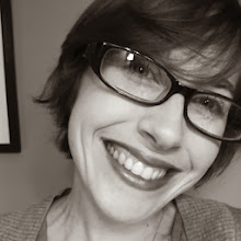
How about this new one? Better? I put the line all the way across and it looked a little stark. But, is this way too narcissistic?
Yes, it looks great. IIt is not narcissistic at all. I really love it!
Thanks! I am happy with it finally. Haha.
Post a Comment